May 2026
•
9 min read
Everyone says they're burned out. But there's a real difference between needing a weekend off and needing to fundamentally change how you're living.
Most private equity and venture capital websites share the same problem: they were built quickly, by someone who wasn't thinking about what an LP actually feels when they land on the page.
The result is a site that either looks like it was made in 2019 and hasn't been touched since, or worse, it looks like a SaaS startup. Bold gradients, enormous hero text, a product screenshot where the portfolio section should be. These aren't design mistakes. They're positioning mistakes. And in a world where your website is the first thing a prospective LP, founder, or co-investor sees before they've spoken to a single person at your firm, they're expensive ones.
I build Framer templates for a living. I've spent enough time studying how finance firms present themselves online to have a real opinion about what works and what doesn't. This article is a straight comparison of the real options available on the Framer marketplace for PE firms, VC funds, family offices, and emerging managers, with no filler.
Why most finance websites lose before they've said anything
Before the list, it's worth naming the actual problem. When a limited partner opens your website, they're not reading, not yet. In the first three seconds, they're forming an impression based on visual language alone, weight, contrast, typography, density, motion.
The visual language of trust in institutional finance is specific. It's not corporate in the blue-button, stock-photo sense. It's not creative in the agency or studio sense. It's somewhere particular, editorial restraint, typographic authority, the feeling that every decision on the page was deliberate.
That's hard to pull off with a general-purpose template. And it's why most VC and PE websites feel slightly off even when they're technically well-built. The structure is there, but the register is wrong.
Here's what I'd actually recommend, in order of fit.
Northbrook
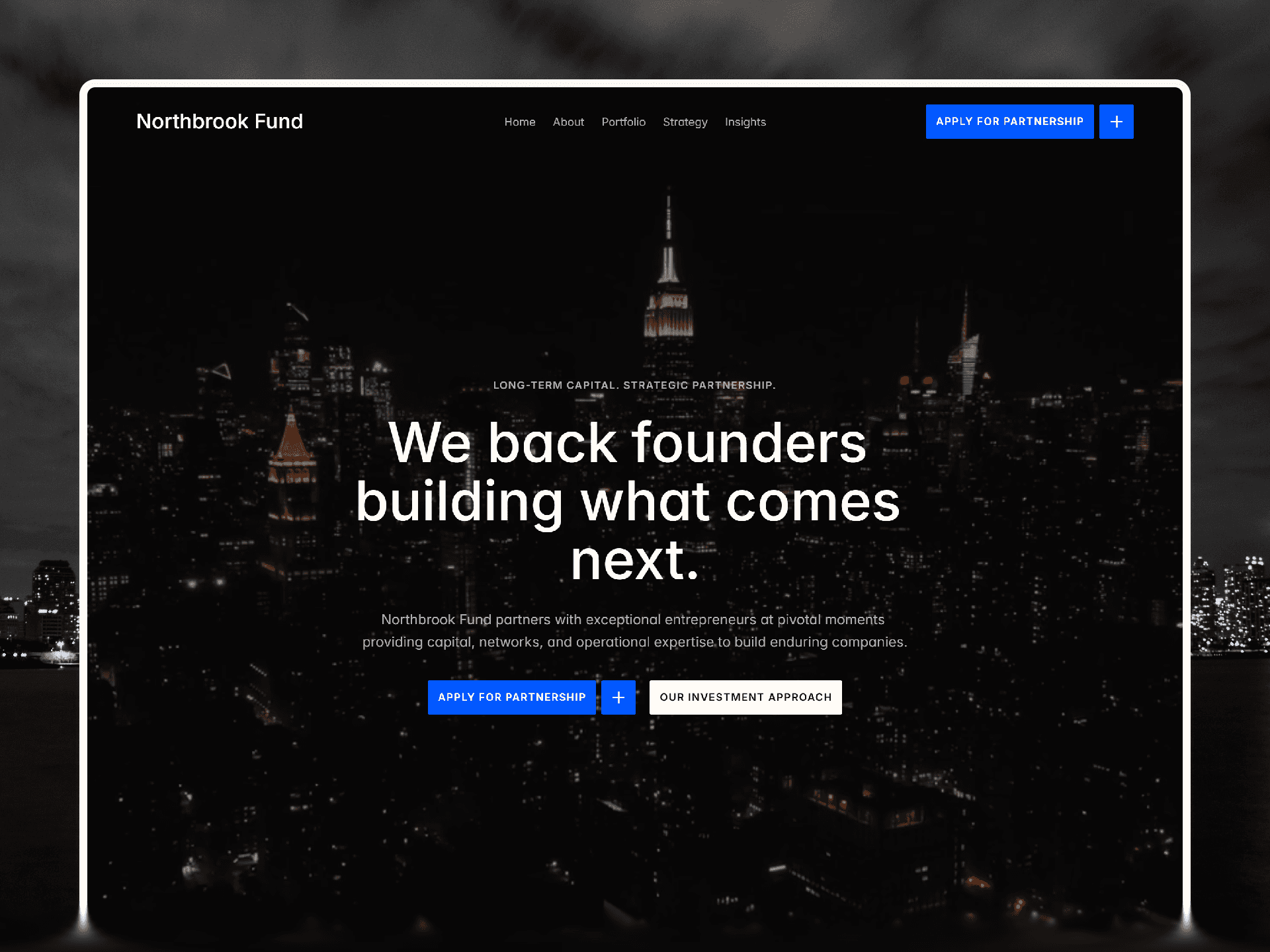
Price: $79, Style: Dark editorial, CMS: Full
I built Northbrook specifically for this context, so I'll be upfront about that. But I'll also tell you exactly what it does and doesn't do well, because the goal here is to give you a useful comparison, not a sales page.
Northbrook's core premise is that dark editorial design communicates institutional authority better than light corporate design for finance contexts. High contrast, controlled tonal balance, deliberate spacing, the kind of visual weight that says stability rather than growth. It's the aesthetic language of Bloomberg, the FT, private banking, not the aesthetic language of a Series A pitch.
The template is fully CMS-powered across portfolio companies, team members, and a news or insights section. The structure is built for content-heavy use, investment theses, fund strategies, LP-facing material, rather than for marketing copy. Responsive across all breakpoints, ships with a live demo at northbrookfund.framer.website, and is set up to launch in under a day.
What it doesn't do, it won't work for firms that want a lighter, more approachable aesthetic. If your LPs are founders and operators rather than institutional allocators, and your brand is deliberately accessible, Northbrook might feel too austere. Know your audience.
Best for: Established PE firms, VC funds raising from institutional LPs, family offices establishing a formal web presence, emerging managers who want to look like they've been around longer than they have.
CapitalOne
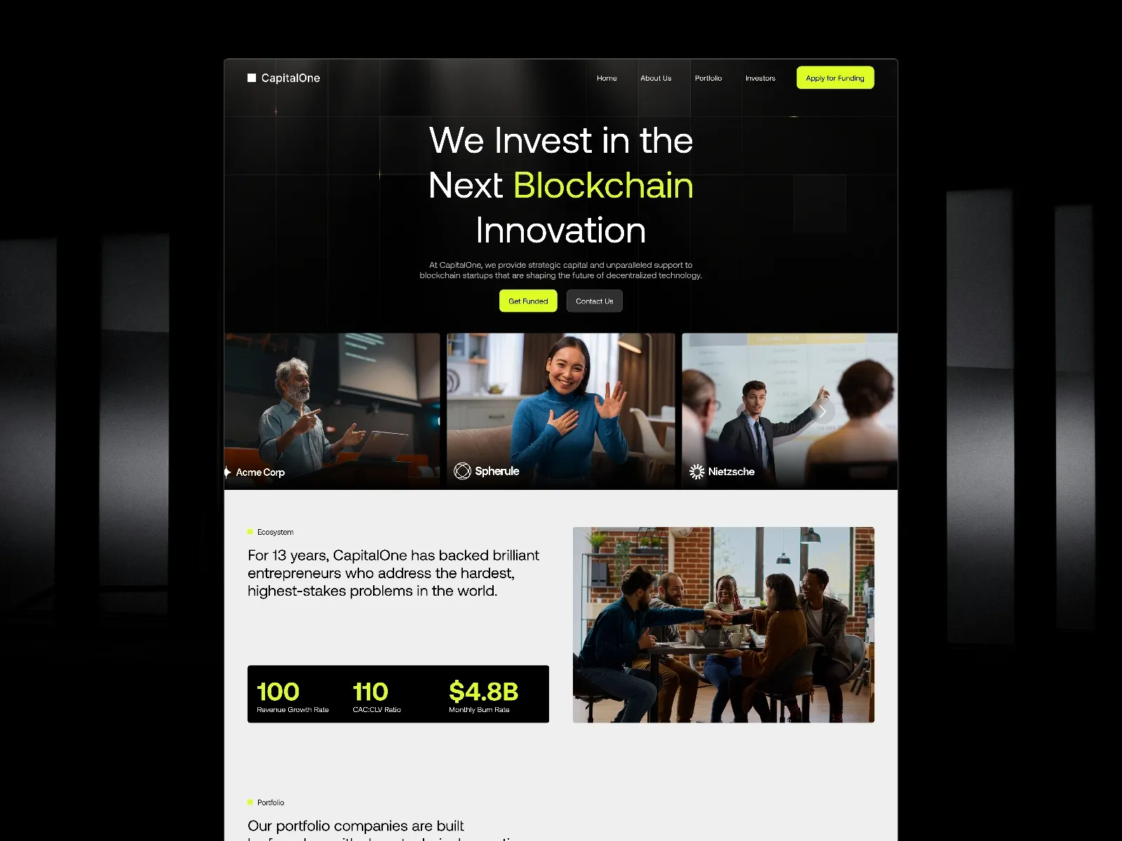
Price: Paid, Style: Light professional, CMS: Full
CapitalOne is one of the more complete templates on the marketplace for investment firms. It ships with two homepage variants, a CMS-powered portfolio and investor section, a careers page, and an application flow for founders, which is a genuinely useful detail for early-stage VC funds that want to receive inbound from startups without handling it manually.
The design is clean and professional without being particularly distinctive. That's not a criticism, for many firms, "clean and unremarkable" is exactly right. You don't want your website to be the story. CapitalOne doesn't ask for much attention, which means your content does the work.
The limitation is that it reads more like a financial services company than a fund. The visual language is closer to a wealth management firm or a consulting group than a capital allocator with a genuine thesis. If your firm has a defined point of view and you want the website to reflect it, CapitalOne will feel slightly generic.
Best for: Multi-strategy firms, family offices that serve external clients, firms where the website is primarily a credibility anchor rather than a brand statement.
Invstor X
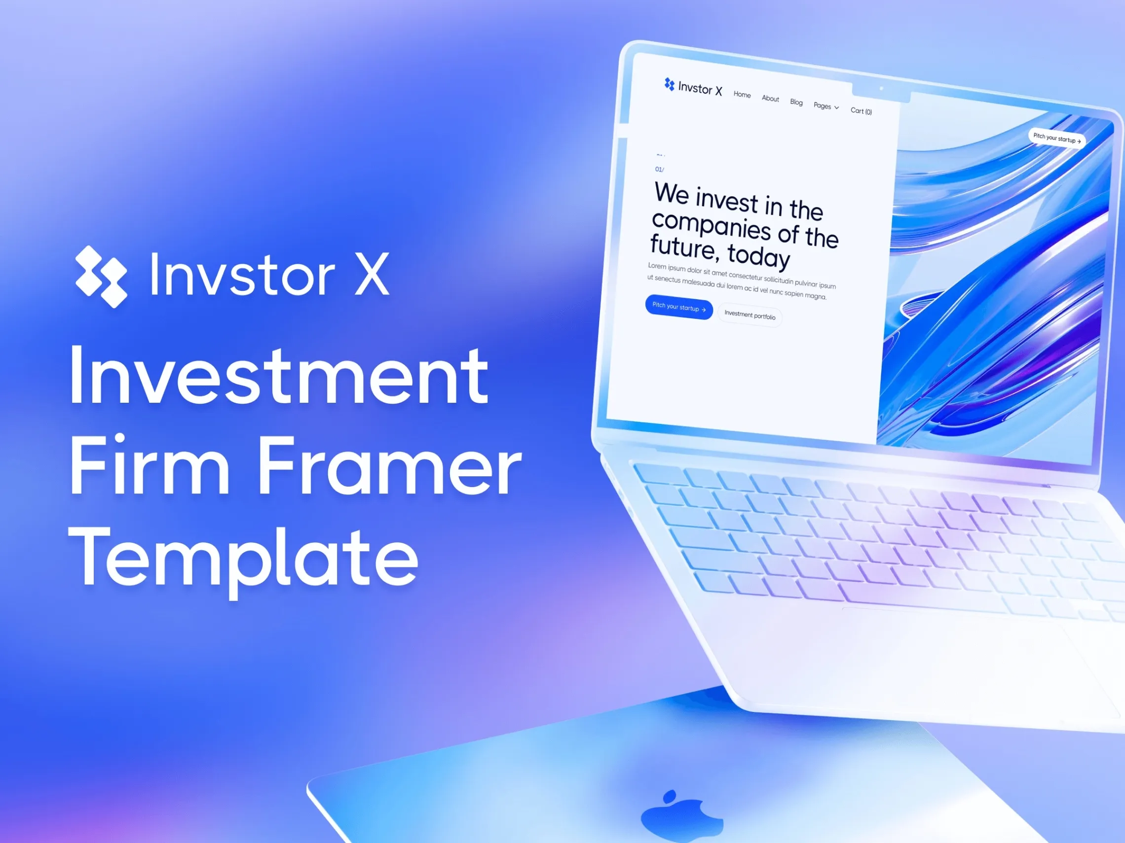
Price: Paid (BRIX Templates), Style: Corporate modern, CMS: Full, Pages: 24
Invstor X is the most comprehensive template on this list. 24 pages, a Figma source file included, CMS integration throughout, and regular updates from BRIX Templates, who are one of the more reliable template publishers on the marketplace.
The sheer scope makes it the right call for firms that need everything built out from day one, deep portfolio pages, team bios, insight sections, contact flows. If your firm is established and you want a website that reflects that operational depth, Invstor X gives you the structure without building from scratch.
The design is on the corporate modern end. It's competent and thorough without having a strong visual identity. For some firms that's a feature. For firms that want their aesthetic to signal something specific about their approach to investing, it's a constraint.
Best for: Established multi-partner firms with large portfolios, funds that need a full-stack web presence rather than a focused brand site, anyone who needs the Figma file for custom design work.
Helixar

Price: Free, Style: Modern minimal, CMS: Yes
Helixar is a clean, modern VC template with smooth animations and a lighter palette. It's well-constructed and free, which makes it genuinely useful for emerging managers who don't have budget yet but need to look credible.
The design skews toward the operator-friendly, founder-accessible end of the spectrum. If your firm invests in consumer, creator, or tech-adjacent categories, and your LP base includes individuals and family offices who are themselves founders, Helixar reads appropriately.
It won't work for firms that need institutional gravitas. If you're raising from endowments, pension funds, or allocators with formal due diligence processes, Helixar will feel slightly too relaxed.
Best for: First-time fund managers, pre-institutional seed and angel funds, operator-first VC with a deliberately approachable brand.
Clarity GV
Price: Paid, Style: Clean editorial, CMS: Advanced (with filtering)
Clarity GV was built specifically for finance and climate-focused ventures, and it shows. The template includes a valuation calculator, advanced CMS with portfolio filtering by sector, and an aesthetic that leans clean editorial rather than either corporate or startup.
For most PE or traditional VC firms this would be a misfit, the climate angle is baked into the design language and would require significant customization to remove. But for impact funds, ESG-focused vehicles, and climate tech investors, it's the most purpose-built option on this list for your specific positioning.
Best for: Climate tech investors, impact funds, ESG-focused vehicles, any firm where sustainability is a core part of the investment thesis.
How to actually choose
The question to ask is not "which template looks best." It's "what does my LP need to feel in the first three seconds on my site?"
If the answer is authority and permanence, Northbrook.
If the answer is professional and complete, CapitalOne or Invstor X depending on how much content depth you need.
If the answer is accessible and founder-friendly, Helixar.
If the answer is mission-aligned and impact-focused, Clarity GV.
One more thing worth saying, the template is the structure. What determines whether an LP books a call is the copy, your investment thesis, your portfolio, your team narrative. No template fixes weak positioning. But a template that works against your positioning, like an institutional fund on a startup-coded template, will cost you credibility before you've had the chance to make your case.
One thing every fund gets wrong on their website
The thesis section. Most funds either omit it entirely or write something so vague it communicates nothing: "we back exceptional founders building category-defining companies." That sentence means nothing.
Your investment thesis is the one thing that separates your fund from every other fund with a similar check size. It's your conviction, written down. If your website doesn't have one, you're telling LPs that you don't have one, which is, for most serious allocators, disqualifying.
Whatever template you pick, write the thesis first. Then build the site around it.
Jalal Eddine builds premium Framer templates for founders, operators, and investment firms.

Written by Jalal Eddine Maoukil
Official Framer Partner & Creator